As a user of Salesforce for seven years, I’ve grown accustomed to Salesforce Classic, but have embraced Lightning Experience as much as possible, working to be an advocate for the new user experience and overall platform. While there are so many positives and exponential potential with the platform, as an end user and Administrator, I’ve run into many frustrations while using Lightning Experience.

The majority of these frustrations have to do with the overall user experience which can make Lightning Experience unproductive. Here are my ten most frustrating user experience issues in Lightning Experience.

1. Lack of Text Wrapping – FIXED!

UPDATE: The Winter ’18 release brought the ability to do text wraps on search results, related lists, and list views. While I’m calling this one  fixed, it would be nice if the columns were wrapped by default.

One reason that Salesforce Classic is so productive is that related lists allowed for text wrapping of fields. With up to 10 fields per related list, field truncation would have been easy, but Salesforce Classic wrapped text based on the size of the browser window so that the full text, of say, the name field, is visible. This, of course, makes selecting a record very straight forward.

Projects-Classic-Text-Wrap

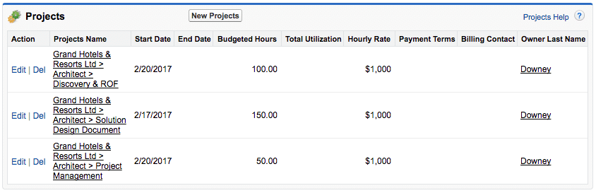
But look at how Lightning Experience handles the very same related list.

LEX-Projects-List-View

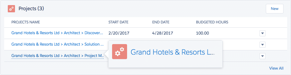
There is no text wrapping at all. As more fields are added to the related list, the amount of text shown in the record name field column decreases. As you can see from the hover card, there is no additional insight into the project name because it’s not wrapped. Clicking View All doesn’t always solve this problem either. In my experience, I resort to either creating a list view or report or clicking to open each record to find the one that I want.

Vote for text wrapping in related lists on the IdeaExchange: Wrap Text on Related Lists in Lightning Experience.

2. Time to Propagate Configuration Changes

As all Salesforce Admins who use Salesforce Classic know, a configuration change can be made on the fly, and the changes are applied in real time. This isn’t always so in Lightning Experience. In most cases, I’ve had to refresh a page multiple times to see the config updates.

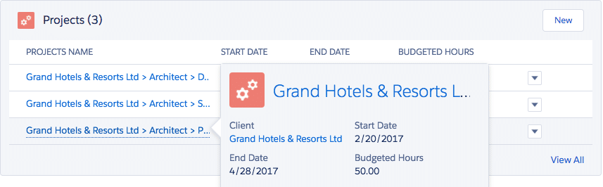
With Spring ’17, I’ve noticed that edits to Lightning Record Pages can take several minutes before seeing the changes reflected on the actual record. For example, I updated the Projects related list hover details before taking the screenshot above, but it took nearly 10 minutes and many refreshes of the Account record to see the changes reflected. Here’s what the Project related list’s hover card looks like now.

Hover-Cards-Updated

3. Save Report Instead of Run Report – FIXED!

UPDATE: The Winter ’18 release brought an all-new Lightning Report Builder in beta and it brings back the Run report option so you no longer need to save the report before running it!

Salesforce Admins live in reports. The majority of the time, the reports we generate are never saved; they are a one-time use for a specific purpose at that very moment, never to be used again. In my use of reports, I use them to perform audits or get a total record count for an object, et cetera.

Save-Report

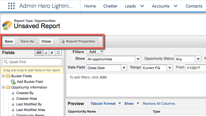
Lightning Experience doesn’t let users create these throwaway reports without saving them first. So now, as an Admin (or even end user), I need to remember to go back and delete the report. A simple workaround is to create a “Trash” folder which the report could be saved to, but this seems like an extra and unnecessary step.

Vote on this idea to bring back the Run button! Lightning Experience: Run Report Without Saving.

4. Background Record Page Loading Time

I use tabs like crazy in my Salesforce orgs. At any given moment, Chrome has at least 5 Salesforce windows open for the org I’m working in. Salesforce Classic allows me to open links in a new tab, and when I navigate to that tab, the record page has already loaded. Super!

Salesforce Classic Open In New Tab

But in Lightning Experience, while it’s getting better, records don’t open in the background that quickly, if at all! Usually, it takes several seconds for the record to load once I’ve clicked on the tab resulting in precious time wasted.

Lightning Experience Open in New Tabs

If the overall speed of Lightning Experience is frustrating, vote for this idea on the IdeaExchange: Lightning Experience LEX – lightning speed please!

5. Open in New Tab Within Setup

When working in Salesforce Setup, not all of the Setup menus have been updated to Lightning Experience. The Salesforce Classic UI doesn’t operate the same in Lightning Experience as it does in Classic. Here’s an example.

Let’s say that I am using Lightning Experience and I want to update a couple of profiles. In Salesforce Classic, I would navigate to Profiles, then open each of the profiles I want to edit in a new Chrome tab. But, in Lightning Experience, if I try to do the same thing, the tab opens but displays nothing. Profiles-Blank-Tab-1

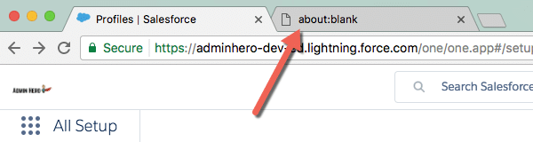
So I either need to duplicate the Profiles tab for each profile to be edited and click into the profiles from the new tabs, or click into each profile in a single tab, make the updates, then navigate back to the profiles list.

6. Chart Oddities

It’s not always immediately noticeable, but some strange reporting chart oddities can be found in Lightning Experience which, once noticed, prove to be quite an annoyance. Here is an example provided by Jorrit Droogsma in his IdeaExchange post on the topic.

rtaImage

rtaImage-1

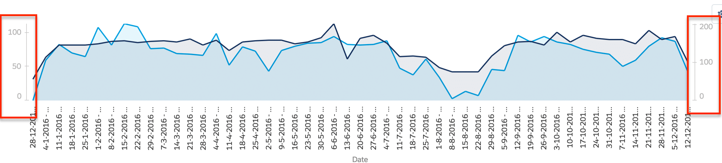
These charts are identical with the first being from Lightning Experience and the second from Salesforce Classic. Notice how the axis is scaled differently in Lightning Experience? It has an impact on how the chart is leveraged.

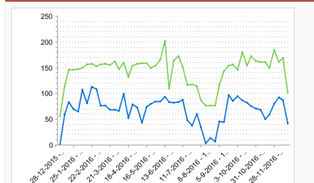
Here’s another example from my friend Matt Bertuzzie; it’s the same chart with the left side showing the chart in Lightning Experience and the right side showing the chart in Salesforce Classic.

donut-chart

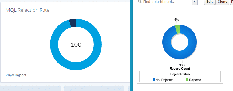
He says, “I know a donut chart sums to 100%. How is this useful at all!” Agreed Matt, agreed.

7. White Space Galore – FIXED!

UPDATE: The Winter ’19 release introduced Display Density settings! Similar to Gmail, you can choose a more dense or less dense view of Salesforce! These settings can be controlled by the user, but a default density setting can be determined by the Admin for the entire org as a starting point! LOVE, LOVE, LOVE this enhancement!

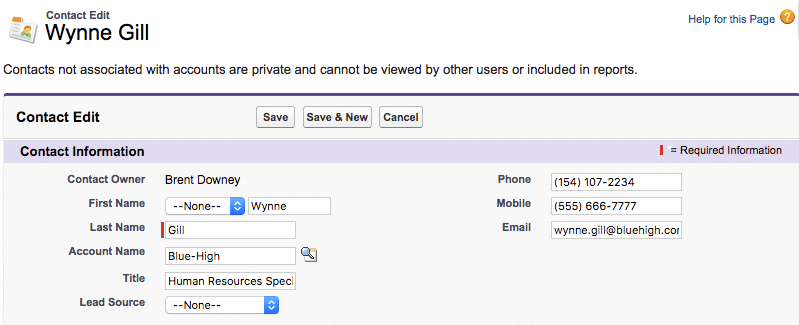
I’m a fan of white space in design, but there are areas of Lightning Experience where there’s just too much of it and in strange places. For example, here’s a contact record in Salesforce Classic.

Contact-in-Classic

And now the same contact in Lightning Experience.

Contact-in-LEX

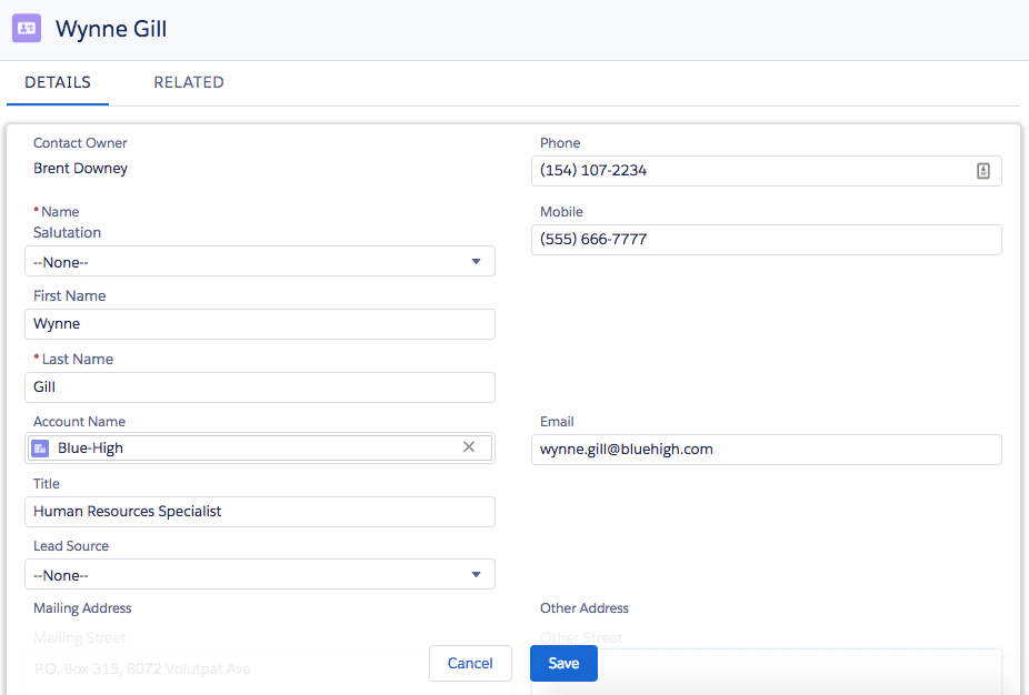
Notice those huge gaps before and after the email field? Salesforce appears to be maintaining the data structure of the page (Email appears to the right of the Account Name field when viewing the record) but, because of the three fields that make up the Contact’s name, there is a lot more white space with no easy solution to alter this.

Here’s an idea to vote up: Too much white space in Lightning UI.

8. Limited Color Contrast – FIXED!

UPDATE: In the last few releases, Salesforce has increased the color contrast, and with the Spring ’18 release, allowed for org branding which further enhances the contrast of the page.

One thing that I think Lightning Experience has is a good overall design. It’s clean and feels modern. But, I almost fee like there isn’t enough color contrast. After using Lightning for an extended period, my eyes find it refreshing to click into Classic to view records.

I’m not a UX designer, but I feel like the fields could be a bit more called out, and the contrast between field labels and field values could be better clarified. For me, the text can start to blur together after a full day of use.

If you want more contracts in the colors of the UI, here’s another idea to vote up: Lightning – Increase Contrast between Text and Background.

9. Sorry to Interrupt – MOSTLY FIXED!

UPDATE: Salesforce has reported that this error has been significantly reduced over the last few releases. I’ve noticed that this is the case, and they continue to work on making the system less error prone! Thank you, Salesforce!

We’re all use to systems producing some error messaging, and I understand that Salesforce wants to collect more accurate user feedback for errors which is why this screen is so important. But, it is intrusive in that it’s a full-screen overlay and, in some cases, the error has presented itself multiple times for a single error. I end up clicking the “x” or “OK” button multiple times for the same error as a result.

Sorry-to-interrupt-2

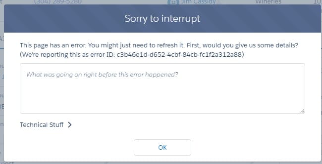
There’s got to be a less obtrusive way to ask for feedback.

10. Stay on the Same Page When Switching to Classic

Lightning Experience has closed the feature gap (in Sales Cloud at least) quite a bit. But every so often, users need to navigate back to Salesforce Classic. For example, in my usage of Lightning, there are records in my production org that require manual sharing. But, manual sharing isn’t a supported feature in Lightning Experience right now.

If I’m on a Salesforce record, and I realize that I need or want to switch back to Salesforce Classic, the current page I’m on in Lightning should be the page that loads when navigating back to Classic. The fact that switching between Lighting and Classic requires retracing navigational steps to access the record is a productivity killer.

Here’s an idea on the IdeaExchange for this very thing: Switch between Lightning Experience and Salesforce Classic – stay on the same record.

Have you found other frustrating or odd user experience issues in Lightning Experience? Share them with me by posting a comment below!

55 thoughts on “ 10 User Experience Issues in Lightning Experience that Need Fixing ”

  1. Great post Brent!

    I think the list is long for LEX improvements. I post these two to a thread in the ButtonClick Admin group. Updated it a bit here.

    Users are really scratching heads about creating a contact from the account – no more address auto-fill. Users have to re-type the address OR the admin has to write a flow or process to do it. It’s one of those common sense things I think the missed and it needs to be addressed soon.

    ….then create Opportunity from Contact – the account doesn’t carry over… Users have to re-select the Account!

    AND lastly a dose of insult to injury. The Account selection window on the new Opportunity only give the account name and no other identifiers like location or country which we need! We have one account a 20 locations with no way to find the right one.

    As you mentioned, it’s also slow, painfully slow even with the newest Chrome browser. I’ve learned the F5 is my new best friend to get page changes to appear. I had a user on the phone and luckily was able to tell them to do that to see an on the fly change I made.

    Finally, Reports and dashboard management – nightmare. It’s a shame because the dashboards are so much nicer in LEX but the Classic “explorer” like layout mad it easier. I think a hybrid that brings that back in would be a big win.

    You’re spot on about white space and contrast. I had to change my screen settings to make it readable. My retinas were getting fried daily.

    Feel free to bump the list to 15 lol.

    Like

    1. I do find myself switching back and forth for various tasks, but I try to stick in LEX as much as possible. But, I do enjoy giving my eyes a rest with Classic after an extended period of time!

      Like

  2. Great to see you back Brent! Thanks for this post. We have yet to move to Lightning because we’re on the Service Cloud, and Salesforce is just starting to move Lightning to the Service Cloud. That being said, I keep hearing things that make me glad we’re on Salesforce Classic. This post just confirms my decision.

    Like

    1. It gets better with every release, so keep evaluating the release notes! Hopefully, it will get to a place that you can leverage the awesome things about lightning (perhaps the topic for an upcoming blog post) which outweigh the negatives.

      Like

  3. Amen on number 5, Brent! Considering how much SF is enforcing JavaScript prohibition on the front end, I find it a little baffling that there’s JS all over the setup tree.

    Like

    1. I suppose it’s a resource allocation issue within the Salesforce teams. I can’t imagine that these pages will remain as they are, but it makes for a frustrating experience in the interim!

      Like

  4. Great post, Brent! You nailed it on all 10 items, but not being able to simply ‘Run Reports’ and the inability to open certain things in new browser tabs are the ones that have bugged me the most. I sometimes get a little nervous for the future of Lightning, but this kind of constructive feedback is what will help things improve.

    Like

    1. These are perhaps my two largest frustrations. Being unable to open in new tabs with the typical keystrokes or mouse clicks on al pages, and saving before running reports has a huge impact in productivity.

      Like

  5. Number 10 is soooo annoying! Especially because not all admin features are available in Lighting so you have to switch between the two.

    Like

  6. LEX definitely has challenges – but to every customer that flat out “refuses” to consider moving to LEX, Salesforce isn’t changing Classic anymore – and given the price of licenses, you are probably doing your organization a disservice by continuing to pay license fees on a product that gets no discernable updates for your user base.

    Like

    1. Completely agree, Chris. Lightning has its merits and really is a great new experience overall. I use it on a regular basis myself and think that it will continue to improve as it grows and matures. My not considering LEX, as you suggest, you’re missing out on a lot of new functionality, and soon, you’ll be behind the 8 ball.

      Like

  7. Brent thanks for the feedback keep it coming. Please make sure you are on the latest version of chrome. This should fix #4.

    Like

  8. Great post and a strong summary of some of the most annoying issues with LEX. We are an early adopter of LEX and I can say though that our sales team LOVES the new interface and feels that the gains far outweigh the unsupported or quirks in the UI. I’ve been in the Salesforce ecosystem for right at 10 years now and believe me this is normal operating procedure for Salesforce when they push major changes. They will put what works out there on their committed dates, then follow shortly thereafter with the missing functionality. If previous experience weighs out, Sales Cloud will be fully functional this year and we’ll then have to deal with the next cloud to get the LEX updates. At least they keep it interesting!

    Like

    1. Thanks for the comment Stefanie! I hope that this post doesn’t make it seem like I don’t like Lightning because I do. I use it in my own production org about 95% of the time. But, there are downsides as well. This is partly because of the age and maturity of the product (which will improve over time). Hopefully, this post is a way to call attention to some of these issues so we can get them fixed and close that 5% gap!

      Like

  9. 100% agree with the post, I find it frustrating that from Setup in LEX I cannot return to home without having to open up a new tab or go back to the previous tab. I want to start moving our org to LEX, alas until some of the basic things are fixed as you have shown, we cannot advocate to users. You certainly have highlighted my key bug bears, the reports and not connecting contacts/opportunities/accounts. This should be basic functionality.

    Like

  10. G’Day Brent,

    Great article but were you trying to be ironic by having your links to the Success pages NOT open in a new tab?

    Cheers, Darrell

    Like

  11. I’m so glad you had the courage to verbalize this and I hope it falls on productive ears. I couldn’t agree with you more. I have been implementing the Salesforce product since 2006. The admin setup is clearly a frame within a frame and my poor nearsightedness cannot even admin in the new interface. I know they were developing this for like 2 years before they released it, but I don’t even think 2 years after it’s release it’s ready for prime time. I literally need to go back to classic for swift buildouts and even to have users process a new form page efficiently to understand it’s layout. I really compare this experience to a Mac. It looks pretty but there the heck are all the functional buttons to do stuff? My clients also don’t like the pictures versus action descriptive buttons like ‘graph’ and ‘filter’ and they were born in the 90s, so I know it’s not my old self complaining. I know Salesforce is so in love with their product, but customers aren’t. Frankly F100 companies are not going to lightening ; I’ve had to downvert new clients as the UI wasn’t as intuitive as Classic. (yet) They either wanted to go to another CRM or get this interface a little more obvious. I sense they finally see this too, because with each new release the new UI is adopting back into some attributes of the old. I love the product, no doubt, but like Coca-Cola. Don’t mess too hard with the recipe.

    Also reports and dashboards – it’s such a delicate design. Where did I originate the dashboard in mixed-UI environments? If I don’t remember, it’s the kiss of death.

    Also, if you used service console or communities you really are just forced down and up into some places.

    Also, while I like the component-concept. I don’t like how Salesforce has made choices on which pages can be declaratively componentized. Do you know how hard versus easy it is to see a product and pricing / price books in the new vs. old world? And I get to write visualforce to “make it easier” because the basic tenet of what the new UI was intended to do is even harder. Not cool.

    The Sales Path while cool in theory is pretty limited when you look under the hood.

    Lastly, why has no one addressed features like mass email, mail merge and the fact that these things will never get presented natively by Salesforce in the new UI? I get the Appexchange, but c’mon.

    I love the product. I don’t like the new UI. It’s not Lightning, it’s thunder right now to me until things stabilize. Sorry.

    Like

    1. Thanks for the comment, Gita. While there is a lot of work to do in Lightning (you’ve touched on a few additional items that were not in the post), I would caution being ‘against’ Lightning. Working with Salesforce for nearly a decade, I too find myself suggesting Classic to clients because it’s what *I’m* comfortable with. Obviously, Classic needs to be used in some deployments because of the requirements, but honestly, Lightning is where it’s at! A ton of development resources are being allocated to Lightning and it’s getting better with each release and we’re seeing fewer enhancements in Classic. Don’t confuse Lightning as just a new UI. It’s a fully new experience (no pun intended) and requires a bit of a mind shift to configure. The more I use it (and I use it every day), the more I like it and the less I find myself switching to Classic. In fact, just today I had to switch to Classic to manually share a record in my production org (that’s not supported in LEX yet) and I couldn’t wait to get back to LEX! Challenge yourself to embrace Lightning; we’ll work through the drawbacks together!

      Like

  12. Brent,

    THis is a great list. Like all of the feedback we get on Lightning, this definitely got the attention of the Lightning core team here at salesforce. I see that Mike responded to one of your points – I wanted to tackle the others.

    1. Text wrapping – We are in the process of looking at text wrapping across the Lightning application with our awesome UX team. Expect to see this addressed in a future release.

    2. Time to propagate changes – Have you ever heard the one about the hardest thing in computer science beng cache invalidation? We’re trying to make a lot of things faster in Lightning so we’re doing a lot more caching. We are optimizing the end user experience. We hear you, but this isn’t something that is likely to change much in the next few releases.

    3. Save Report to Run Report – We have a new report builder in development. As soon as that is out, this will be fixed.

    4. Multi-tab loading – Mike mention the Chrome update. This makes a huge difference. I’ll also use this opportunity to encourage you to try out the console navigation available in the Spring release if you are a person who likes to have a lot of tabs open. I’m loving it.

    5. Open in new tab in Setup – Fixed in the summer release!

    6. Chart oddities – I’m going to have the report team post their own update here with details of their roadmap.

    7. White Space – This is a fun one. Believe or not, some customers tell us there isn’t enough white space. Since we can’t win, we have a feature on the roadmap to allow you to choose your white space level like Gmail Compact vs. Cozy modes.

    8. Limited Color contrast – Contrast is a thing we are also evaluating but will likely be unable to please all of the people all of the time. We intend to extend our branding capabilities to make this much more configurable but it is more than a release or two away.

    9. Sorry to Interupt – You’re right. We are looking at our error messages. We are also working very hard on making sure we just don’t show them to you.

    10. Stay on the same page on switch – I’ll be honest with you, we aren’t going to do this. We want folks in Lighting. We aren’t going to de-support classic, but we have no plans to make the switching experience easier or better in any way. We’d rather use those developers to make Lighting so awesome you don’t want to leave.

    Hope this is helpful. Thanks as always for the feedback.

    Shawna Wolverton
    SVP, Lightning Experience

    Like

  13. Hey Brent,

    Thanks for putting this list together. I’m still reluctant to switch to Lightning. Today, September 2017, do you think they fixed the problems you raised?
    Thanks!

    Like

  14. I love this article as an admin moving towards Lightning. I’ve added an Idea to the Idea’s community that I feel like addresses issue #5, at least when dealing with objects, my Idea doesn’t directly address if you were doing work on the “Home” tab, but same logic would be applicable here. SHAWNA WOLVERTON’s message says this was addressed in the Summer release, but I don’t see a way to open new setup sub tabs.

    Here is a link and hopefully they will figure something out.

    https://success.salesforce.com/ideaView?id=0873A000000TsLFQA0

    Like

  15. I’ve been trying for months to like LEX, but Lightning is horrible as a user. Just horrible…and people thought classic was bad! Salesforce management, Admins and Developers should be forced to do 3 weeks (80 calls/day+) on this thing prior to touching ANYTHING. The cutesy cartoon animals would disappear, that’s for sure.

    But as they say, the software is sold to Executives, not users. Horrible.

    Like

    1. Thanks for your comment, Drew! I’ve been using it myself for almost two years now (with the exception of moving back to Classic to manually share the occasional record) and I actually prefer it over Classic now. That isn’t to say that all of the issues have been resolved, but now that I’m used to it, (and we’ve configured the org to fit our needs) it’s a much better experience. I think the key is that Admins will need to spend some significant time thinking about the rollout to users, and building out the LEX UI to suite their needs for maximum productivity. Some of the benefits of LEX only functionality outweigh the use of Classic in my opinion.

      Like

      1. Thank you for your measured response, Brent! This is one of the only forums where honest discussion of the drawbacks of the shift are addressed. For my part, I’m in an organization where Executives who do not use the software, who have not hired a certified admin or developer, and have not built out classic to work properly for the company, have decided to mandate usage of Lightning for certain portions of the company, but not for others. Fortunately, I’m not in the mandated LEX bunch…yet. The key is, Lightning is “sexy and cool”, and is being improved in drips and drops. Mandating its’ use in a company that is already behind the game on Classic is causing incredible waste of time and energy as the few people who understand how to configure the system must do so on both platforms, must train on both platforms, must think of both at the same time. It’s short-sighted and unwise, and has hindered productivity enormously. The overhanging sense that “Classic will be taken away any day now” has caused our company to make hasty, uneducated decisions. It’s not LEX’s fault, but Salesforce has had a hand in creating urgency that my company can’t handle effectively.

        Like

        1. Just to be clear, Lightning isn’t being updated in “drips and drops.” Every release is now 100% Lightning Experience. Classic is no longer being updated in Salesforce’s release schedule.

          While it may not be a well organized approach, moving the Lightning is a good way of ensuring that your org can continue to use all of the new features coming to Salesforce. The key is that it should be properly configured.

          It sounds like your management teams needs a guide. Would there be any interest in hiring a firm to help with the migration from Classic? We’ve done our fair share of Lightning Migrations.

          Here’s an free ebook that may also be helpful. https://www.shellblack.com/ebooks/salesforce-secret-formula-migrating-from-classic-to-lightning/

          Like

  16. Great Post. Definitely some UI/UX issues with Lightning. These are some great examples. I’ve voted up many of the ideas. Thanks for posting this.

    Like

  17. Someone may have already mentioned this, but for # 2, you can disable caching. Not recommended in production, but we typically disable caching in sandboxes so that we can do rapid testing when performing configuration changes.

    Setup > Session Management > Enable secure and persistent browser caching to improve performance

    Like

    1. WHEN DO YOU LOGIN TO SALESFORCE WE SEE SETTINGS AND LOGOUT OPTIONS i WANT TO HIDE SETTINGS FOR SOME USERS BUT i COULDN’T DO . dO ANY NOW ANY ALTERNATE WAYS TO PREVENT USERS FROM CLICKING ON SETTINGS

      Like

  18. Thanks, Brent. You posted this blog in early 2017 and it appears there’s still an issue with #2. At least it appears that way. I am well experienced with Classic and have only worked in Lightning a handful of times. So I’ve been pulling out my hair trying to find a way to make the account page layout changes appear in the lightning page. I’m so discouraged with the time wasted on trying to figure it out. Do I need to continue to hit refresh or will the changes magically appear if left alone over a period of time?

    Like

  19. Hi,

    Thanks for the article as it has summed up a few of the growing pains of adjusting from Classic to Lightning (as an Admin of a good-sized org.)

    One thing I am struggling to get around is when I am in Lightning (in a Sandbox) Setup>Administration>Users, and I click on the Lightning button for ‘View User Detail’ to edit a user’s field information (such as ‘Mobile’).

    Case 1 (a user other than my self i.e. non-Admin)” On the user record page screen in Setup in Lightning, it takes me to the Classic User detail page (within a Lightning setup frame), showing the classic ‘Edit’ button. However, when I click ‘Edit’ button (as I normally would in Classic) I get at truncated Lightning popup window of the Edit screen that does not contain many key fields (just shows the ‘About’ and ‘Contact’ section with Standard info but none of the custom fields I want to edit).
    On the sidebar of this view it stays in Administration>Users when I am looking at this window.

    Case 2 (editing myself, a System Administrator profile): When I try on MY OWN User record (Administration>Users>Click on my name from the list of ‘All Active Users’> click classic ‘Edit’ button on my User detail page), something different happens: 1. I am viewing my ‘User Edit’ screen with complete field details (as I would in Classic — desired), 2. the SIDEBAR changes from the standard Administration>Users path to ‘My Personal Information>Advanced User Details’. When I test-edit a field and ‘Save’, I am navigated back to the non-edit view of my User detail page, and the sidebar reverts back to its original Administration>Users path.

    Is there a way to enable this ‘Advanced User Details’ for ALL users so that within Lightning Setup I do not need to switch to classic to get to the Classic ‘Edit’ view where I can see all custom User fields?

    Thanks,
    Vince

    Like

    1. It sounds like maybe a caching issue. Have you tried clearing the cache in your browser? Are you seeing this happen in another browser as well? I know that not all of the pages in Setup are redesigned in LEX design language, so many of them still have the Classic look and feel in a “wrapper” of sorts, but the behavior of these pages should be the same as in Classic.

      Like

  20. My biggest one is logging out as a User does not take you back to their User record, it goes back to the Last View you used. So you have to look them up again.

    Like

  21. This is a great page! It is very helpful. Has anyone had this problem with Chatter tab on the Opportunity record in Lightning, or know how we can fix this? When going to the Chatter tab on an Opportunity, the full set of Chatter conversations does not display, but rather only sections of the conversations. We have to keep searching through the different sections, one at a time, to find a specific update.

    Like

  22. there is not feature parody and salesforce is aware of this. To market it as containing parody is wrong. A HUGE example, my team recently spent 155 hours building a budgeting function to read from time logged and compare against a custom budget record. We built the visual budget feature as a lighting component only to learn our pdf export functions were very limited, this then needed to be converted to a VF page……rework

    Liked by 1 person

      1. That’s actually an interesting thought to have components shared/available via permission set. But, there is a working – using the filtered component setting in the Lightning Page would do the trick. You can filter by user attributes including profile, fields, and I believe permission set assignments.

        Like

Leave a reply to Gita Kulkarni Cancel reply

This site uses Akismet to reduce spam. Learn how your comment data is processed.